My first 7 days with the Apple Watch
Waste of Time
This post is also available in: German
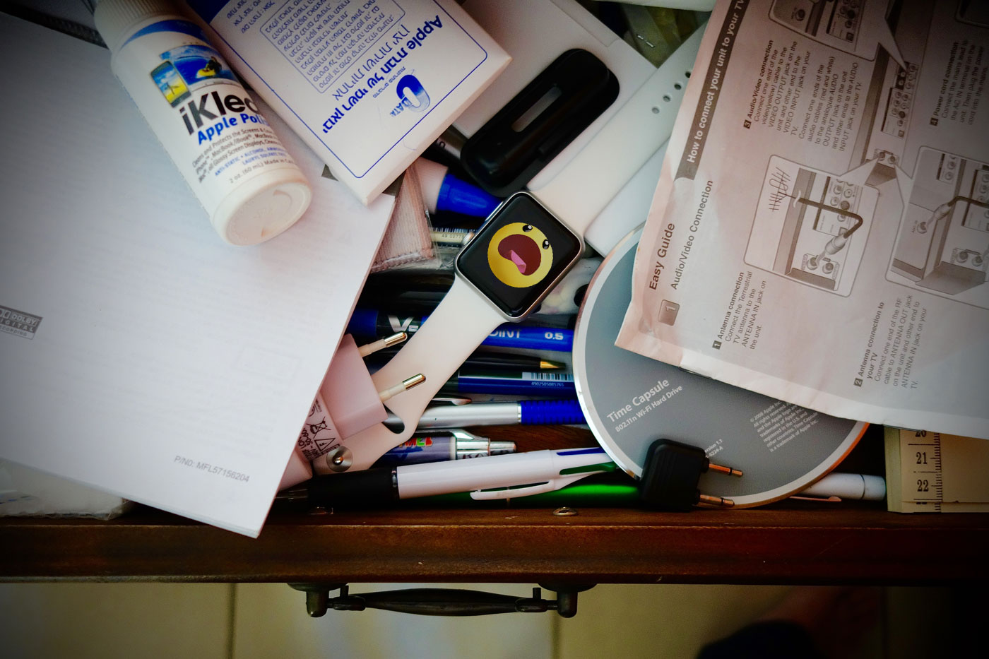
Rarely have I been so clueless after checking out a new Apple product. The Apple Watch is ambitious, but it fails at even the most mundane tasks. My prognosis is that this device will find its place in the world — and that place will be in people’s drawers, right next to the old chargers and no-longer-cool iPhone accessories.

Prologue
Apple and Instructions. I can’t remember ever to have owned an Apple product that required a manual; “plug and play” has been synonymous for just about any innovation from Apple since the iMac.
Do you remember? When the iPad first came out it came with a postcard-sized instructions sheet. It carried a picture of the device with discreet pointers to the buttons: Power, Volume, Orientation lock. That was it.
Of course there never was a need for instructions for the iPad! I can imagine how Steve Jobs insisted that this piece of paper was added to the boxes, just to thumb his nose at the competition with their weighty manuals.
The Apple Watch is different: You do need lengthy instructions. Contrary to what we are used to from Cupertino, the Apple watch is anything but self-explanatory.
Assisted Trying
A friend and I — both not entirely inexperienced with things technological — tried to send simple messages to each other via our new watches, knocking signals, cartoons, all the nifty little things that look so easy in the advertising. It was a complete failure. We both had to check out how it works through the net, because we couldn’t find out by simply trying.
That wasn’t the only thing. I really had a hard time to customize the watch to my needs. I don’t need to emphasize that I have been a more-than-early adopter of every new iWhatever that came to the market for the last decade or so. It certainly wasn’t the first time that I have configured a new Apple device.
Rarely has Apple gone to greater lengths in order to explain a product.
Assisted trying, an invitation for an initialization session, a good dozen of tutorials on the Apple homepage — rarely has Apple gone to greater lengths in order to explain a product. They must know why over in Cupertino.
Bevor I get to my real problem here are the things I like about the Apple Watch: the hands-free calling function. Whether you are driving or sitting on your couch, it is fun to talk on the phone with the watch.
And the design, of course! Oh boy, how I love the look & feel of this watch! As is so often the case with Apple products, it starts with opening the package.
 The first impression
Never before has the opening of an Apple product been so elaborate: tear flaps on the box and on the casket, a box embossed with gold, a chic plastic box (Sport Edition) and not to forget the watch itself: a piece of jewelry!
Even the cheapo plastic wristband of the sports edition looks exquisite and feels great to the touch. Ever since I’ve had my first exposure to the watch at the launching event back in Cupertino, I would have bet my iPad that the Watch would become a mega-seller.
It just doesn’t work!
But that first, positive impression changes as soon as you start actually using the thing. One disappointment after the other. Not an experience to remind you of the old Apple motto “it just works”.
Hooking up the Watch to my iPhone worked without any problem. But then came the first doubts induced by the following dialogue: Did I want to transfer my apps from the iPhone? … Yes (is this advisable?). Displaying individual apps in “glances”? … hmmm (what are glances?!). Then came a step I was to regret: confirm daily fitness targets. I’ll get back to that later.
 Configuration
Once the Watch has been customized (which takes ages!), you can’t help feeling a certain disenchantment. All settings have to be done on the iPhone, not on the Watch. The iPhone is a remote control for the Watch and vice versa. Sounds funny — but that’s how it is.
It gets even more complicated: some settings are done in their respective partner apps on the mother ship. Others on the other hand can be found in the sub-menu of the Apple Watch App. And still others are directly linked to the basic settings of the iPhone. There comes a point when you don’t know anymore where to look for which setting.
Inception
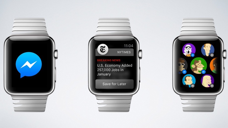
If you want to change, say, time zones, share prices or the weather forecast on your watch, you have to use the basic settings function of the phone, but you have to dive deeper into the logic of the watch if you want to see Breaking News on it. For that you have to activate Push Messages in the basic settings of your Apple Watch which sit on your phone — needless to say somewhere hidden in a sub-menu.
After that you have to go down one level and select your desired topics in the sub-sub menu of the app.
 That was the moment when I wished I had a spinning top in order to test to what level my Apple inception had taken me.
Rise and Shine
As if all this hadn’t been enough, there is the built-in fitness tracker! As I mentioned in the beginning, I made the mistake to accept the recommended basic settings when I initialized my watch. Since then the watch has kept reminding me of my fitness targets at the most untimely moments: In a movie theater I was told to get up, because I hadn’t met my daily standing-up target yet. Of course this was done with a noisy buzz, a beep and a light display in order to make sure everyone around me had to notice.
 The Apps
And then the apps: On that teeny-weeny screen Instagram, photos or games are about as much fun as playing soccer without a ball. That effect is aggravated by the time it takes to load any required data from the iPhone to the watch — it takes so long that the screen goes into standby and gets black.
OK, you might say the watch wasn’t meant for that type of data-intensive application anyway. But even the shortest of newscasts are not very convincing on that display. You should think that Twitter with its limitation to 140-characters is practically made for an Apple Smartwatch. Not so.
Too complex, or too reduced. The Watch poses more questions than it answers.
The official Twitter App for the Apple Watch consists of two functions: Timeline and Trending Topics. Because you can’t even display a complete tweet on the watch, you have to reload your timeline after every 5 Tweets. That’s about as much fun as clicking through a picture gallery that was created to generate as many pageviews as possible.
What’s more, if you want to open a video or an embedded link, you are referred to your phone. The watch does not have that function! The second function, the worldwide Trending Topics is even more useless — zero information.
And here lies the fundamental problem of the Apple Watch, I think: A lot of functions are just too complex for it, and therefore can’t be used at all. Others are so reduced that the watch poses more questions than it answers.

Conclusion
No way would Steve Jobs have allowed this product to get to the market in this form.
The Watch looks fantastic, it makes a great present and probably that alone will make it sell OK. It’s a nice piece of technology that you might like to be seen with for a while, before it gets buried in a drawer somewhere next to your old chargers and the no-longer-cool iPhone accessories.
The Apple Watch is trying to do too much, and it delivers too little. Unlike previous Apple products it cannot really be used intuitively.
The apps are useless, but that has more to do with the size of the display than with the programs.
Newscasts, games or music — the Apple watch does not offer anything that the iPhone couldn’t do better, and because most functions on the iWatch won’t work without the iPhone anyway, you might as well grab your phone in the first place.
Apart from the hands-free call function on my wrist I really can’t see any other added value.
The Apple Watch is a gimmick which reminds me of the Apple Newton. Fantastic in theory, unusable in practice. I would have liked to do without this remark, but I am quite certain that Steve Jobs would never have allowed the Apple Watch to get to the market in this form.
[…] 8 Monate später bleibe ich bei meinem Urteil vom Frühjahr (Blogpost: Apple Quatsch): Die Apple Watch in ihrer jetzigen Form ist ein für Apple untypisch unfertiges Produkt, das unter […]